Tag Archives: responsive website design

Responsive website can enhance website visibility and sales

Online business is impossible without a website that we all know. But, only having a website so to say is same as not having one. The market is unthinkable competitive and having a professional look and advanced features are necessary. No one is going to notice your business online when it possesses nothing to interest or attract them. There are uncountable e-commerce websites which offer a range of products, starting from baby products to groceries. The unique features and offers your business provides should be highlighted in the website.

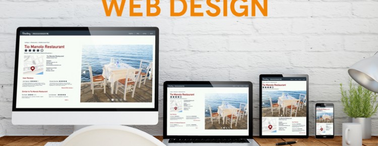
What is more important, is the layout, should be so designed and developed with user-friendly approach. Easy accessibility improves the staying time of the visitor. It reduces the bounce rate to be specific. Never try to ignore the need of responsive website design and development if you want your business to be successful online. Most of the people resort to mobile and other small screen devices like tablet and laptop. A properly designed site that can have a great view on other devices apart from desktop can increase the rate of conversion or lead generation. It’s completely true that we create to aim to earn good amount of profit in the business.

More use of flash files can make the website heavy and increases the loading time. It can reduce the number visitors as no one is going to wait for long for your site get loaded. Minimalism is the trending approach that gives a great web design. Website development should be so done that it requires minimum time to get load. The easy navigation can help the user to go through the pages of the website to get a clear view.

Now let us discuss the other benefits of responsive web designing

Adaptation to all devices

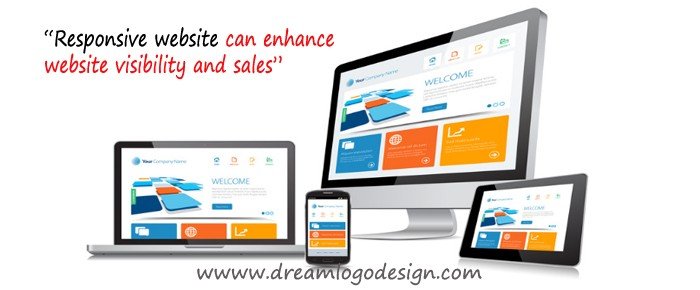
One of the most important advantages of Responsive web design service is that they provide a wonderful user experience across all the different devices without having any problem about the device’s screen sizes. The appeal lies in the fact that there is flexibility in its uses which is a typical characteristic of this advantage. All the websites optimized in this manner have a remarkably fair chance of having a universal look.

Support for all kinds of browsers

It is really difficult to work at SEO on the website of the same company on different devices such as mobile phones, tablets, and laptops. In short, it doubles the work of the SEO master. If there is a single website for both mobiles and laptops then there is slightly little stress for the SEO taskmaster. In this case, only a single link needs to be optimized. The benefit is that the website will gain more in popularity if there is higher performance rate.

Low cost & higher maintenance

The third feature is that the cost factor is minimized and inevitably, in turn, lowers the maintenance charge. The utility, in this case, is that the there will be a flawless flow of audience to the website without any hang-ups. The reason for it is that there will only be a single website instead of multiple websites which need to be optimized and this will result in lower costs.

Better user experience can really give you business success

What makes a website successful? Is it the content? The design? The online marketing? What makes a website successful is a topic that I felt should not go unexplained seeing as more and more businesses are looking to the internet to present their identity, advertise and gain leads. It seems having a successful website is becoming more of an asset to businesses, large and small, than ever before. After some research as to how a website is successful, it turns out it requires content, design, and online marketing, but is a bit more complicated than that. There are some key ingredients, which are fairly self-explanatory, but could take another whole blog entry to explain their importance. Those ingredients include appropriate content, appropriate marketing (SEO, advertising, blogging, social media), and appropriate design. But there is more thought that needs to be placed in the design process, aside from making sure the visual brand is upheld, that can turn a decently successful website into a website that is responsible for generating 50%+ of total leads per month. And that thought process applies to what is called the user experience (UX).

The user experience is how the user feels when navigating through a website and how they may respond, physically (in terms of actions), intellectually and emotionally to the website. The way the user interacts with the website will actually help determine if they will take action and complete the overall goal the website was designed to incite. If the way a user might feel when navigating through the site is taken into account before and while the website is being designed, the final product will generate more leads.

There are many factors that go into creating an optimal user experience. They involve combining form and function to carry out a final goal. Breaking them down into steps will help give more insight into creating the optimal user experience.

  • Consider the industry the website will be applied to and the target audience that may become users of the site. How are they expecting the site to look and function?
  • Think of the goal of the website and what action you would like the users to complete. Is the best possible outcome a potential lead contacting your company personally? Is it purchasing a product?
  • When beginning to design the site, it is important to utilize the idea of flow. Creating this flow involves the visual design, content and navigation of the site. Is navigating the site cohesive yet stimulating, easy to understand, yet entertaining to peruse and keeps the user’s attention? In creating the main pages and sub-pages, it is important to make sure that the visual flow, as well as the flow of the content, are seamless to make the path to the final goal seamless. This seamlessness can also create a feeling of flow within the user. Flow, as an action, is defined as the state in which one becomes fully and positively immersed in an activity to the point they lose conception of time. Some athletes would describe flow as “the sweet spot.” When users feel flow, they are fully immersed in the exploration of a new and relevant website and are more likely to follow the flow and fulfill the ultimate goal.
  • During the website design process, it is also important to design with a human touch in mind. A user will respond more positively if the website seems as though it was designed for them and what they are seeking when visiting the website. Being as straight forward as possible with both design and content can achieve this, but adding some warm and/or humorous yet professional undertones can instigate the flow you want to initiate. If the user is receiving all the information they are seeking in a stimulating and efficient way, but also feel as though some thought was put into the presentation, as though they are interacting with another human in an entertaining way, they build trust with the website and, ultimately, the company and individuals that work for the company. Initial interaction with the user once the user has made contact is almost always more positive than if the site had been confusing and less welcoming.

While creating a website design that successfully includes all of these ideas might sound like it’s easier said than done, if incorporated into the initial brainstorming process and carried out throughout the design, it will still come through the design and make a noticeable difference in the final result.

Intelligent techniques and tools for web design

This year is really actively one while we talk about designing tools hitting the market. Photoshop is no more the only escape, though it is one of the most finest one still plenty of other tools and weapons that are being employed by designers to create great industrial repute.

The line of difference between the designer and developer seems to become faint as static mock-ups has lost it’s importance. So working combined the tools also have to tailored accordingly for the best use. The year of Hi Dpi screen is in and has captured the arena for designers were in search of to create a designs that are easily accessible at various devices.

Pixate –
Pixate as a tool has been developed to making perceptive, interactive paradigm for iOS and Android. What makes it different the other options drag and drop elements and interaction panel.

Affinity –
Affinity created by Sherif closely resembles Photoshop and the app is faultlessly designed. Working using Affinity feels like it is developed to serve the web and graphics designers dedicated as a tool. The features like adjustable and nondestructive images that is, it allows to tweak the images or flat design images without distorting it. The high zoom level 1,000,000% is like a blessing to the designers whereas Photoshop offers 32, 000 only. It more useful while using vector designs. Easy handling of history and undo makes the app really smooth tool and to top it all it allows to undo up to 8000 steps.

Avocode –
Specially created for the ease of front-end developer for coding the websites from the format it has been created o the Photoshop or sketch. Brought in the market by the team of makers that has given us CSS Hat, so it’s quite guessable that they have made the exporting method to the next easier level. However, the previous tool enable to export assets, but what is best about Avocode is that it can use the Photoshop plugin of it to synchronize the PSD file to Avocode just with one click. It is so advanced to interpret and analyse PSD file turns flawlessly to UI design.

Macaw –
Macaw was created with the designers point of view completely. And this is so because it offers creating of responsive web design without changing even touching any coding, providing proper display for the mobile devices. The tutorial video will enable you to use and create a responsive layout within an hour that can serve the purpose greatly.

Conclusion: While you have so many tools for making the designing process easier and perfect then exploring those can be interesting as it was for me. If you are yet to check the effective tools and techniques just give it a shot.

Benefits of responsive web design in the business

In the rapid paced world most of the things have its online identity, that is every product and services are searched online more. People opt to be at their place and just browse through the online stores to get their required items at their door step hassle-free. And to establish a distinguishable brand identity you have to ensure that you have the most user friendly websites. To provide the best user experience inevitably the website has to be responsive one that can be viewed clearly on various screens like in mobile, tablet, iPad and on a desktop computer. It is also an aspect of creative web design.

Nowadays, people rarely use desktop computers or laptops to find products and even to connect to social media sites. The e-commerce sites are the most searched for various required things in the day to day life that too on the mobile phones it is very handy and are suitable to search anytime. RDW makes a great difference in the perceiving of the user and leads to increase conversion rate, that is required for a successful business.

Nowadays, people rarely use their laptops and personal computers to access social networking platforms, e-commerce website and so on, whereas, they tend to depend more on their tablets and on their smart phones for browsing through it, as they are more handy and functional, thus being appropriate for those who are always keep traveling or for the normal office goers too. This is why responsive web design can make a great difference in the way the visitor comprehends a website and, ultimately, it can also increase conversion rate remarkably, an aspect that is especially essential for business owners. Here you will find out more about responsive web design, mobile-friendly websites and their benefits.

Now let us explore the other major benefits of a responsive design:

Better ranks in Google Search Result Page (SEO)

No point, disagreeing that we create a website to get brand identity, web traffic and lead generation. This ought to be the most important criteria of a business owner, be it a small or big business, it can establish better it requires continual traffic and conversions. Now let’s find out how responsive design works wonder for the same.

When you have a responsive web design it is flexible for all screen types and devices apart from that you don’t have to invest in creating a different versions for different screens. The URL remaining the same you SEO gets stronger and leave your worries for getting another one for iPhones and other devices. Even Google claims that a responsive website has chances to rank higher.

Improved sales and Revenue

As I mentioned in the previous paragraph that responsive design leads to more traffic generation which in order increases sales and revenue. Being responsive you have only one version of a website that provides us with a single style sheet (CSS) for a better consistent in terms of user experience as this ensures longer stay of visitor on your website viewed from any device. Better user experience ascertains more leads or more sales.

Increased offline user experience

Many of the android phones and tablets justify HTML5 that serves best offline browsing features. This feature enables users to read email, newsletter perfectly well even if they do not have an internet connection.

Why is responsive design profitable for e commerce business?

By this time you must have heard the term responsive design many a times. Now, the question is what it implies and what is it useful for? So, let me make the concept clear to you as this web design format is going to prevail in the web world more in the coming years. Responsive web design is adapting the tools and opting the format to make the website friendly for all the screen types including, laptop, tab and mobile phones. It is highly recommended for e-commerce websites as it requires to be receptive. Web surfers prefer to surf on various platforms according to availability of the device at that point of time. For instance, you want to order a gift for your friend and you have no time to hop in to different stores, and you need to search on mobile, so the website should be mobile friendly to be viewed without fuss. In order to have a perfect display on small screens it needs to responsive. It has been seen that most people use mobile and smart phones, 60% more for local searches and go for it. It is evident that to acquire more business successfully you need to have a mobile friendly website.

Here I am providing few good reasons why responsive design is necessary for eCommerce websites.

Fit for all screens: These design formats can ensure the best viewing for any screen size. Previously websites were only made to suit the desktop computers. After the increased use of mobiles and other smaller devices, it became an indispensable need to have a design for a website that can be viewed on all smaller screens without irritating the user. If a website not responsive then it is unreadable, links jumble up and images break for the smaller screens. Overall, nothing can be gauged from this type of view.

Clear View for Accessing the Features: If we consider the usability factor, these websites are much more upgraded than the previous ones. Every feature can be easily used without any problem like it used be for the desktop instead of looking like a maze for the users.

Added Advantage is cost-effective design: It is cost-effective for the business owners as they don’t have to spend more on designing a website in various versions for different platforms. Equipped with advanced tools and technologies present day designers guarantee that one version of a website can fit in all screen types, making it lucrative.

Flexible Design and great adaptability: Content and images that are used on these websites can adapt with the up-gradation of technologies and leave options for modification. This makes the designing part easier as they don’t need to change the thing completely and maintenance of the website becomes lucid.

Reduce Bounce rate: ‘Bounce Rate’ implies the percentage of viewers in your website that leaves the site without staying at it for more than 10 seconds, that in order decreases the rate of conversion. Bad navigation, slow page loading are some of the reasons for increased bounce rates. Responsive site designer ascertains low bounce rates by making the navigation panel easy and increasing the usability of the website.