Tag Archives: professional website design

Can Algorithm-Driven Web Design changes be benefiting?

With the advancing technology and minutely ingrains more into more and more use of UX to improve theuser experience. The key terms at present are personalization, relevancy, and interactiveness from (UX). This means the designing process has become more intricate and the challenge has to be faced for creating a website that can understand and convey for the users and all through the process.

The old concept in the sense being traditional is gradually moving away. Earlier it was the work of the designer to make the site look good for the audience. But now it is much more than that. It’s transformed to be much more than that. Whereas now it is not limited to looking good it has to make it story like for the user.

Conversational UI design:
2016 already marked the path for conversational designs as opined by Chris Messina “2016 will be the year of conversational commerce”. Various messaging channels such as Facebook messenger, We Chat are getting priority more than the social media platforms and apps are being downloaded more and marketers are pondering about the ways to utilize the change.

Animations and videos or GIFs:
As the trend is people are preferring animation or GIF inclusion more and making them attracted to the websites. Moreover, these make the design more interactive and easily comprehensible to the target web traffic. But avoid overusing them. Through GIF’s one can easily depict a workflow, or creating a user guide format.

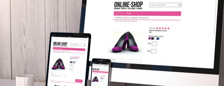
Advanced Responsive web design:
Responsive web design will continue to rule the arena as it’s one of the easiest ways to create good UX. CSS queries allow more flexibility to structure according to the various devices in which the website is been browsed. In 2016, Google updated its algorithm for ranking value more the websites that have optimized content throughout the year, so the website makers must abide by the situation that and create a tailored design that will provide an apt display on all devices and also the conversion rate will also improve because of it.

Minimalism is still in:
Minimalism has acquired a new high or level for the year 2017, so in place of visiting the home page, the web visitors are offered with a ‘card’. There are pop-up designs or points that convey as a doorway for getting information. In a website, this cards lure the audience visually and make them understand the topic to click to know more.

Professional web design companies are adept with these changes and create a website that suits your requirement and abide by the advanced trends leading to more sales.

Why is responsive design profitable for e commerce business?

By this time you must have heard the term responsive design many a times. Now, the question is what it implies and what is it useful for? So, let me make the concept clear to you as this web design format is going to prevail in the web world more in the coming years. Responsive web design is adapting the tools and opting the format to make the website friendly for all the screen types including, laptop, tab and mobile phones. It is highly recommended for e-commerce websites as it requires to be receptive. Web surfers prefer to surf on various platforms according to availability of the device at that point of time. For instance, you want to order a gift for your friend and you have no time to hop in to different stores, and you need to search on mobile, so the website should be mobile friendly to be viewed without fuss. In order to have a perfect display on small screens it needs to responsive. It has been seen that most people use mobile and smart phones, 60% more for local searches and go for it. It is evident that to acquire more business successfully you need to have a mobile friendly website.

Here I am providing few good reasons why responsive design is necessary for eCommerce websites.

Fit for all screens: These design formats can ensure the best viewing for any screen size. Previously websites were only made to suit the desktop computers. After the increased use of mobiles and other smaller devices, it became an indispensable need to have a design for a website that can be viewed on all smaller screens without irritating the user. If a website not responsive then it is unreadable, links jumble up and images break for the smaller screens. Overall, nothing can be gauged from this type of view.

Clear View for Accessing the Features: If we consider the usability factor, these websites are much more upgraded than the previous ones. Every feature can be easily used without any problem like it used be for the desktop instead of looking like a maze for the users.

Added Advantage is cost-effective design: It is cost-effective for the business owners as they don’t have to spend more on designing a website in various versions for different platforms. Equipped with advanced tools and technologies present day designers guarantee that one version of a website can fit in all screen types, making it lucrative.

Flexible Design and great adaptability: Content and images that are used on these websites can adapt with the up-gradation of technologies and leave options for modification. This makes the designing part easier as they don’t need to change the thing completely and maintenance of the website becomes lucid.

Reduce Bounce rate: ‘Bounce Rate’ implies the percentage of viewers in your website that leaves the site without staying at it for more than 10 seconds, that in order decreases the rate of conversion. Bad navigation, slow page loading are some of the reasons for increased bounce rates. Responsive site designer ascertains low bounce rates by making the navigation panel easy and increasing the usability of the website.